
Adding a feature to the existing Zara website.
My Role
UX/UI Designer
Team
Kubra Yuksel (Solo)
Duration
2 weeks
BRIEF: This is a study of the possibility of adding a new feature to the Zara.com desktop website. This is just a concept and not done by Zara.
OVERVIEW
Global fashion brand Zara is one of the world’s largest retailers, online as well as offline.
PROBLEM
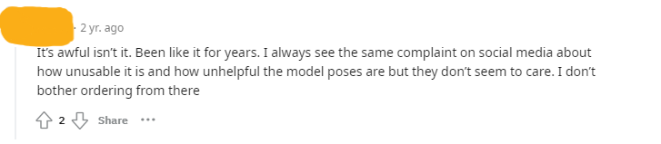
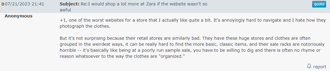
Zara’s website has been regularly criticised for its bad design and poor user experience.
To get a better idea of where the brand stood, I first looked at the competition and searched forums and review sites. Different forums, pages, and YouTube channels talk about how bad the usability of Zara's website is. It became quickly apparent that Zara's website was falling behind. They have a magazine look, modern visuals, and an Avangard look on the website. However, the website causes frustration to users with its poor usability, inefficient navigation, and unhelpful product photos of how products fit regular people instead of the models with perfect body sizes.
GOALS
My primary focus on this project is to involve users in the experience of shopping online.
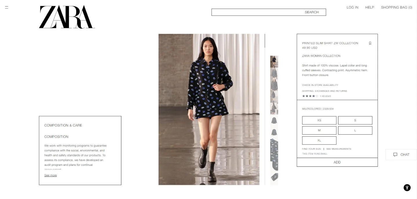
Adding a review section would help customers understand how products fit in all different body types and sizes.
PROCESS

How can we involve users in the experience of online shopping at Zara?
Allowing customers to rate how well products fit them. That would clear the questions in new customers' minds and give an idea of whether a specific product would run small, big, etc.
Let customers add reviews, so they feel involved and this would also help them to understand what other people’s experience.
Here are some of the main points of concern I found that consumers faced.
USER RESEARCH
Poor usability
Unhelpful Product Photos
Accessibility Issues


SEARCH AND IDEATION


OUTCOME