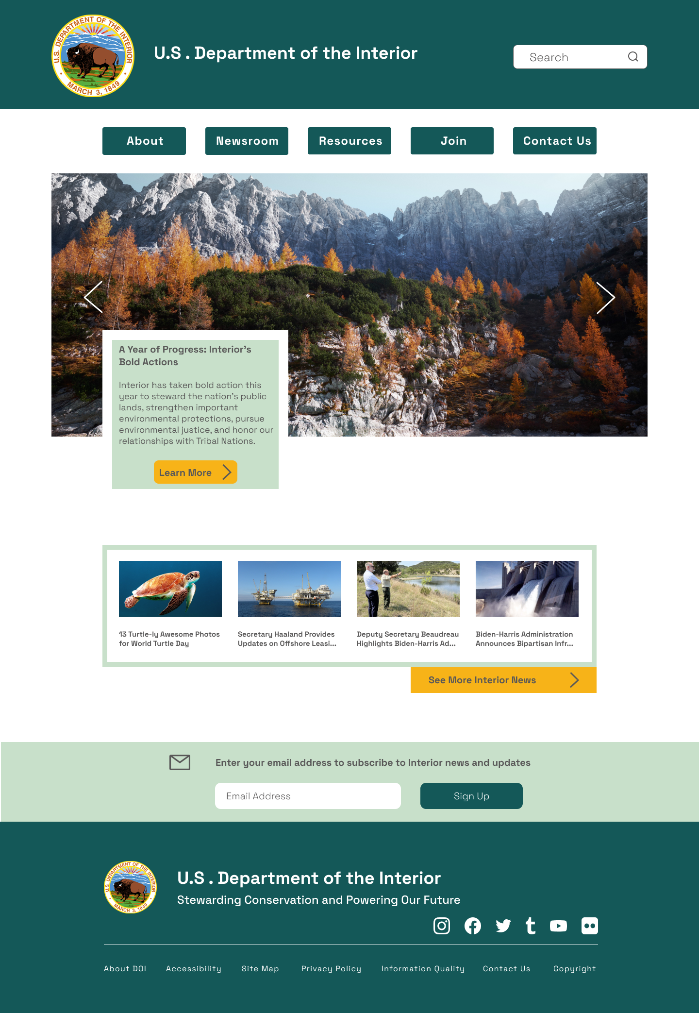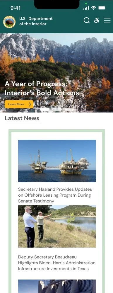
A concept design for the U.S. Department of Interior Website
Role
UX/UI Designer
Team
Kubra Yuksel (Solo)
Duration
3 weeks
OVERVIEW
The Department of the Interior was formed to protect and manage the nation's natural resources and cultural heritage. It manages public lands and minerals, national parks, and wildlife refuges and upholds Federal trust responsibilities to Indian tribes and Native Alaskans. Additionally, Interior is responsible for endangered species conservation and other environmental conservation efforts.
PROBLEM STATEMENT
The website is very informative and it contains all kinds of information you would need. However, the amount of links and tabs are frustrating for users. It causes confusion and frustration.
GOALS
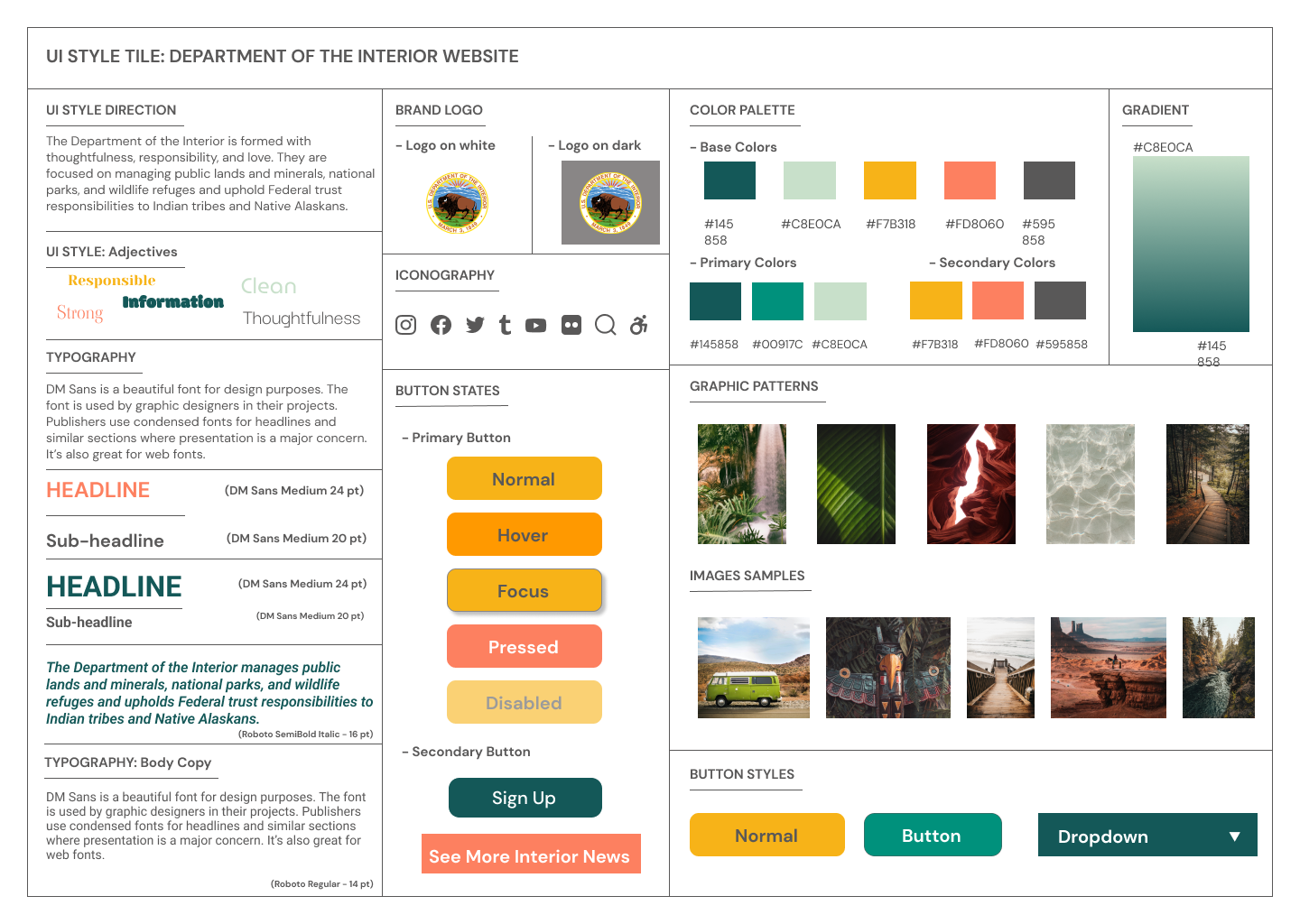
Provide users a less complicated and practical navigation menu. Putting user needs at the forefront of the design. Have the colors serve as the main theme of the website.
PROCESS
Performing task-based behavioral interviews with interviewers to understand behavior and pain points, as well as mapping out their journey.
Analyze the website, user test results to come up with a new sitemap, also color palette.
Rapidly prototype new sitemap, test and iterate it.
USER TESTING
I conducted Usability Testing, Navigation Testing, and Heuristic Evaluation Checklist to understand the current user pain points while using the Department of the Interior website.
-

The footer part was very small to read and there was unnecessarily lots of quick links.
-

Users didn’t understand why there was a lot of tabs and links on the website.
-

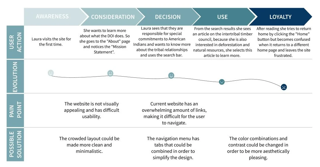
Users had to keep going back to the homepage several times until they found the right area.
USER TEST RESULTS
I prepared some questions to identify the current pain points that users may struggle with when using the U.S. Department of the Interior's website.
The biggest challenge users had was the density of the information and lack of visual clarity.
NAVIGATION ANALYSIS AND COLOR ANALYSIS
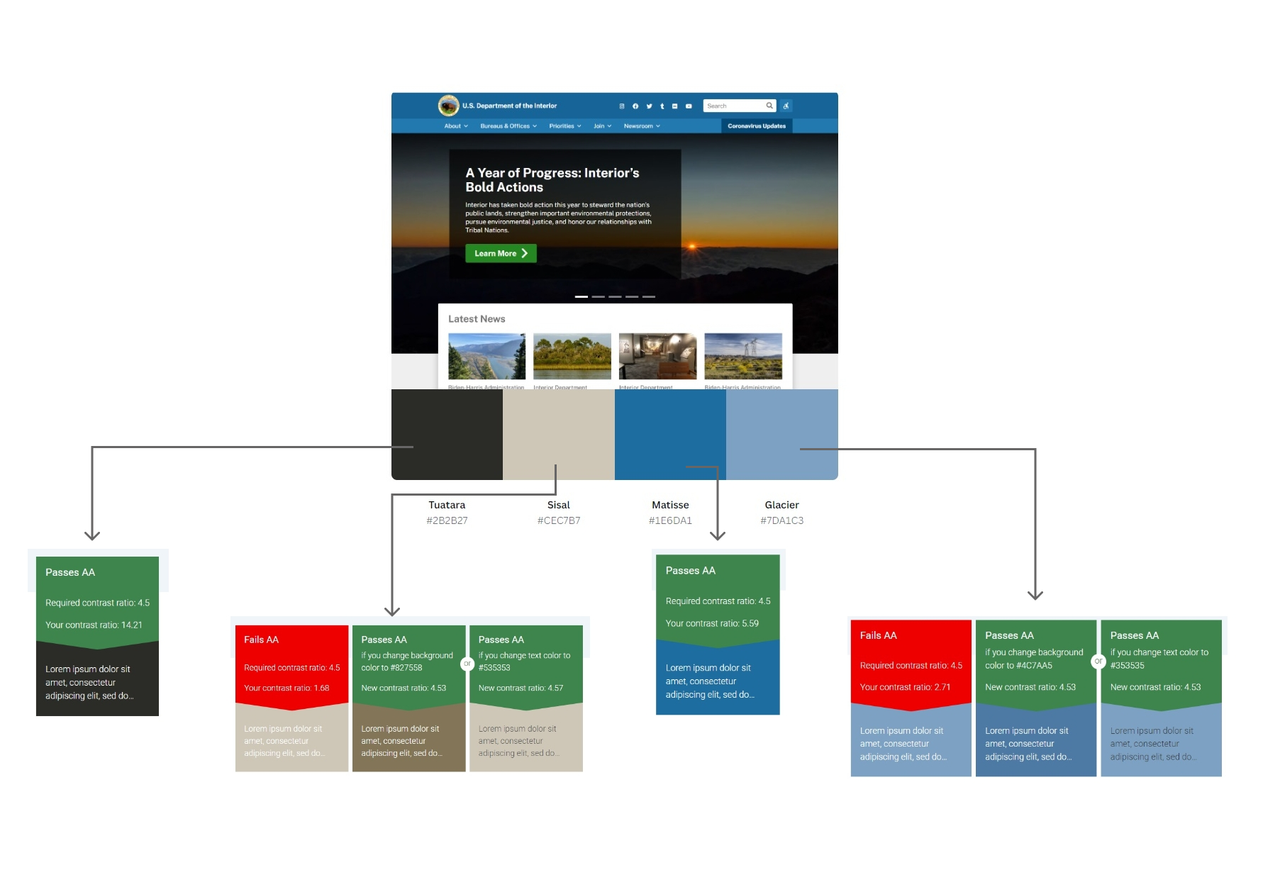
Based on interview results, I targeted some pain points then tested the color accessibility of the main page.
DOI Navigation Analysis
DOI Color Analysis
Some colors on the website did not pass the color accessibility test.
USER PERSONA
After identifying the pain points based on user interviews, I created the user persona.
USER JOURNEY MAP
Laura’s journey map
POSSIBLE SOLUTIONS
An updated, clean, and modern web design.
A clearer navigation menu.
Using a simpler color combination that prevents tiring eyes.
Using fewer tabs and links to prevent confusion and time consumption.
Putting user needs at the forefront of the design.
NEW SITE MAP
Regarding to pain points from interviews, the navigation menu is changed to increase the usability.
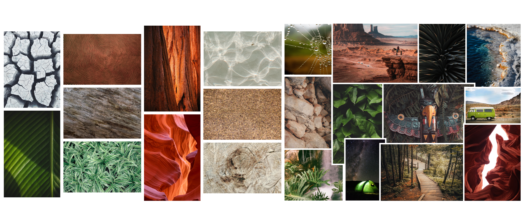
MOODBOARD
UI STYLE TILE
PROTOTYPING
FIRST NAVIGATION PROTOTYPE
The navigation menu has tabs that are combined to simplify the design.
The color combinations and contrast are changed to be more aesthetically pleasing.
The crowded layout is changed to a more clean and minimalistic layout.
USABILITY FEEDBACK
Users found the redesigned website very organized, simple, easy to navigate, and very consistent.
Each page stands own its own but its design is very consistent throughout the whole website.
They also shared how the color palette serves the purpose of the website better.
ITERATED DESKTOP DESIGN
ITERATED MOBILE DESIGN
OUTCOME
The Department of the interior has lots of informative articles and resources. I enjoyed very much creating a visually aesthetic design for a government website that does not give a formal and boring look.
In the future, it can be added little visual interactions and maybe code reading on the website to make it interesting for users to experience.
If you'd like more information, feel free to contact me at yukskubra@gmail.com.

